SVG 背景缩放
SVG 相比其他格式为我们提供了更多的灵活性,与此同时当我们把它用作背景图形 background-image 时有更多需要我们注意的东西,尤其是在我们使用 background-size 属性时。本文描述了在使用这些属性时如何处理 SVG 图像的缩放。
规则概要
大部分计算方式可以用这四条规则来概括。这些规则基本上涵盖了大部分情况除了个别边缘问题。
- 当
background-size指定了固定的尺寸(百分比或者其他单位),会按照固定的尺寸来。 - 当图片自身存在固有的比例(宽高比恒定,诸如 16:9、4:3、2.39:1、1:1 等等),渲染出的尺寸使用这个比例。
- 当图像指定了尺寸,并且这个尺寸没有被修改,则使用指定的尺寸。
- 当不是上述情况时,则图像将呈现与背景区域相同的大小。
总体来说,上列尺寸计算规则关心的是一个图像有无定义的尺寸和比例,与图片格式没有关系。具有固定尺寸的 SVG 图像依然被视为大小相同的光栅图像。
源图片示例
在深入研究使用background-size并不同类型图片的影响并且得到结果之前,我们先来看看不同尺寸和大小的图像示例。
在每个例子中,图像被渲染在 150x150 的容器内,并且在下方提供了 SVG 文件资源
无尺寸无比例
指定一个维度的尺寸,但无固定比例
指定一个维度的尺寸,有固定比例
无宽高,有固定比例
缩放示例
现在让我们来看看这些图片在各种缩放情景下怎么展现。以下例子都是宽 300 高 200 像素的矩形。此外, background-repeat 都设为了 no-repeat,以便看得出来缩放的情况。
备注: 以下截屏只表达符合预期的渲染效果。目前不是所有的浏览器都能正确的渲染这些代码。
两个维度都指定尺寸
如果你使用 background-size 指定了两条边的长度,those lengths are always used, per rule 1 above. In other words, the image will always get stretched to the dimensions you specify, regardless of whether or not the source image has specified its dimensions and/or aspect ratio.
Source: No dimensions or intrinsic ratio
Given this CSS:
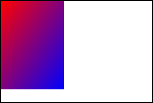
background: url(no-dimensions-or-ratio.svg);
background-size: 125px 175px;
The rendered output would look like this:
Source: One specified dimension, no intrinsic ratio
Given this CSS:
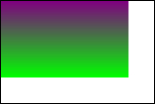
background: url(100px-wide-no-height-or-ratio.svg);
background-size: 250px 150px;
The rendered output would look like this:
Source: One specified dimension with intrinsic ratio
Given this CSS:
background: url(100px-height-3x4-ratio.svg);
background-size: 275px 125px;
The rendered output would look like this:

Source: No specified width or height with intrinsic ratio
Given this CSS:
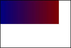
background: url(no-dimensions-1x1-ratio.svg);
background-size: 250px 100px;
The rendered output would look like this:
使用 contain 或者 cover
当 background-size 指定为 cover 时,图片能多小就多小,只要依然能覆盖整个背景区域。而指定为 contain 则会使得图片能多大就多大,只要不被背景裁切就好。
For an image with an intrinsic ratio, exactly one size matches the cover/fit criteria alone. But if there is no intrinsic ratio specified, cover/fit isn't sufficient, so the large/small constraints choose the resulting size.
Source: No dimensions or intrinsic ratio
If an image doesn't specify either dimensions or an intrinsic ratio, neither rule 2 nor rule 3 apply, so rule 4 takes over: the background image is rendered covering the entire background area. This satisfies the largest-or-smallest constraint.
background: url(no-dimensions-or-ratio.svg);
background-size: contain;
The rendered output looks like this:

Source: One specified dimension, no intrinsic ratio
Similarly, if the image has one dimension specified but no intrinsic ratio, rule 4 applies, and the image is scaled to cover the entire background area.
background: url(100px-wide-no-height-or-ratio.svg);
background-size: contain;
The rendered output looks like this:

Source: One specified dimension with intrinsic ratio
Things change when you specify an intrinsic ratio. In this case, rule 1 isn't relevant, so rule 2 is applied: we try to preserve any intrinsic ratio (while respecting contain or cover). For example, preserving a 3:4 intrinsic aspect ratio for a 300x200 box with contain means drawing a 150x200 background.
contain case
background: url(100px-height-3x4-ratio.svg);
background-size: contain;
The rendered output looks like this:

Notice how the entire image is rendered, fitting as best as possible into the box without clipping any of it away.
cover case
background: url(100px-height-3x4-ratio.svg);
background-size: cover;
The rendered output looks like this:

Here, the 3:4 ratio is preserved while still stretching the image to fill the entire box. That causes the bottom of the image to be clipped away.
Source: No dimensions with intrinsic ratio
When using an image with no intrinsic dimensions but an intrinsic ratio, things work similarly.
contain case
background: url(no-dimensions-1x1-ratio.svg);
background-size: contain;
The rendered output looks like this:
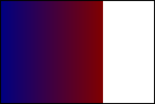
Notice that the image is sized to fit the smallest dimension while preserving the 1:1 aspect ratio.
cover case
background: url(no-dimensions-1x1-ratio.svg);
background-size: cover;
The rendered output looks like this:
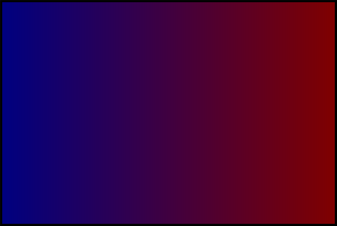
Here, the image is sized so that it fills the largest dimension. The 1:1 aspect ratio has been preserved, although with this source image, that can be difficult to see.
Automatic sizing using "auto" for both dimensions
If background-size is set to auto or auto auto, rule 2 says that rendering must preserve any intrinsic ratio that's provided.
Source: No dimensions or intrinsic ratio
When no intrinsic ratio or dimensions are specified by the source image, rule 4 takes effect, and the image is rendered to fill the background area.
background: url(no-dimensions-or-ratio.svg);
background-size: auto auto;
The rendered output looks like this:
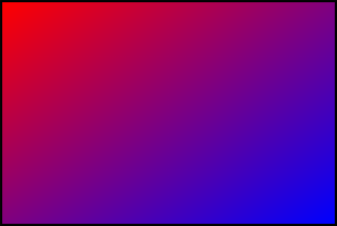
Source: One dimension and no intrinsic ratio
If no intrinsic ratio is specified, but at least one dimension is specified, rule 3 takes effect, and we render the image obeying those dimensions.
background: url(100px-wide-no-height-or-ratio.svg);
background-size: auto auto;
The rendered output looks like this:
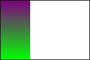
Note here that the width, which is specified in the source SVG at 100 pixels, is obeyed, while the height fills the background area since it's not specified (either explicitly or by an intrinsic ratio).
Source: One dimension and an intrinsic ratio
If we have an intrinsic ratio with a fixed dimension, that fixes both dimensions in place. Knowing one dimension and a ratio is, as has been mentioned already, the same as specifying both dimensions explicitly.
background: url(100px-height-3x4-ratio.svg);
background-size: auto auto;
The rendered output looks like this:

Since this image has an explicit 100 pixel height, the 3:4 ratio explicitly sets its width at 75 pixels, so that's how it's rendered in the auto case.
Source: No fixed dimensions with intrinsic ratio
When an intrinsic ratio is specified, but no dimensions, rule 4 is applied — except that rule 2 also applies. The image is therefore rendered just like for the contain case.
background: url(no-dimensions-1x1-ratio.svg);
background-size: auto auto;
The rendered output looks like this:

Using "auto" and one specific length
Given rule 1, specified dimensions are always used, so we need to use our rules only to determine the second dimension.
Source: No dimensions or intrinsic ratio
If the image has no dimensions or intrinsic ratio, rule 4 applies, and we use the background area's dimension to determine the value for the auto dimension.
background: url(no-dimensions-or-ratio.svg);
background-size: auto 150px;
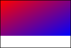
Here, the width is determined using the background area's width per rule 4, while the height is the 140px specified in the CSS.
Source: One specified dimension with no intrinsic ratio
If the image has one specified dimension but no intrinsic ratio, that specified dimension is used per rule 3 if that dimension is set to auto in the CSS.
background: url(100px-wide-no-height-or-ratio.svg);
background-size: 200px auto;
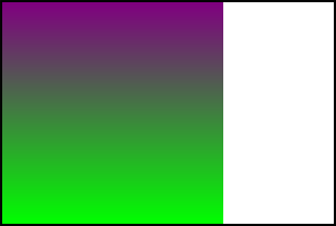
Here, the 200px specified in the CSS overrides the 100px width specified in the SVG, per rule 1. Since there's no intrinsic ratio or height provided, auto selects the height of the background area as the height for the rendered image.
background: url(100px-wide-no-height-or-ratio.svg);
background-size: auto 125px;
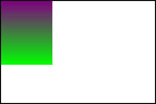
In this case, the width is specified as auto in the CSS, so the 100px width specified in the SVG is selected, per rule 3. The height is set at 125px in the CSS, so that is selected per rule 1.
Source: One specified dimension with intrinsic ratio
When a dimension is specified, rule 1 applies that dimension from the SVG to the rendered background unless specifically overridden by the CSS. When an intrinsic ratio is also specified, that's used to determine the other dimension.
background: url(100px-height-3x4-ratio.svg);
background-size: 150px auto;

In this case, we've overridden the height of the image in the CSS to be 150px, so rule 1 is applied. The intrinsic 3:4 aspect ratio then determines the width for the auto case.
Source: No specified dimensions with intrinsic ratio
If no dimensions are specified in the SVG, the specified dimension in the CSS is applied, then the intrinsic ratio is used to select the other dimension, per rule 2.
background: url(no-dimensions-1x1-ratio.svg);
background-size: 150px auto;
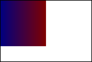
The width is set by the CSS to 150px. The auto value for the height is computed using that width and the 1:1 aspect ratio to be 150px as well, resulting in the image above.
