Box alignment in grid layout
The CSS box alignment module details how alignment works in various layout methods. On this page, we explore how box alignment works in the context of CSS grid layout.
As this guide aims to detail things which are specific to CSS grid layout and Box Alignment, it should be read in conjunction with the box alignment overview guide, which details the common features of box alignment across layout methods.
Basic example
In this example using grid layout, there is extra space in the grid container after laying out the fixed-width tracks on the inline main axis. This space is distributed using justify-content. On the block cross axis the alignment of the items inside their grid areas is controlled with align-items. The first item overrides the align-items value set on the group by setting align-self to center.
Grid axes
As a two-dimensional layout method, when working with grid layout we always have two axes on which to align our items. We have access to all of the box alignment properties to help us achieve this.
The inline axis is the axis that corresponds to the direction that words in a sentence would run in the writing mode used. Therefore, in a horizontal language such as English or Arabic, the inline direction runs horizontally. Should you be in a vertical writing mode, the inline axis will run vertically.
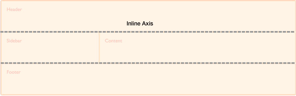
To align things on the inline axis you use the properties that start with justify-: justify-content, justify-items and justify-self.
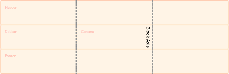
The block axis crosses the inline axis in the direction that blocks are displayed down the page — for example, paragraphs in English are displayed one below the other vertically. This is the block dimension.
To align things on the block axis you use the properties that start with align-, align-content, align-items and align-self.
Self alignment
These properties deal with aligning the item inside the grid area it is placed into:
The *-items properties, align-items and justify-items, are applied to the grid container and set alignment for all grid items as a group. The *-self properties, align-self and justify-self, are instead set on grid items. This means that you can set alignment on all grid items, and then override any items that need a different alignment by applying the align-self or justify-self property to the rules for the individual grid items.
The initial value for align-items and justify-items is stretch, and the initial value for align-self and justify-self is auto, so the item will stretch over the entire grid area. The exception to this rule is where the item has an intrinsic aspect ratio, for example an image. In this case the item will be aligned to start in both dimensions in order that the image is not distorted.
Content alignment
These properties deal with aligning the tracks of the grid when there is extra space to distribute:
This scenario will occur if the tracks that you have defined total less than the total width of the grid container.
Gap and legacy grid-gap properties
These properties define the spacing between grid items within a grid container:
The grid specification originally contained the definition for the properties grid-row-gap, grid-column-gap and grid-gap. These have since been moved into the Box Alignment specification and aliased to row-gap, column-gap, and gap. This allows them to be used for other layout methods where a gap between items makes sense.