Creating color palettes with the CSS color-mix() function
Colors can sometimes get out of hand in a project. We often start with a few well-chosen brand colors, but over time, we may find ourselves adding variations as our project grows. Perhaps we realize that we need to adjust the lightness of a button color for accessibility reasons, or that we need a slightly different variant of a component. How do we ensure that the colors we choose fit within the design system for our project?
I've been exploring using the relatively new CSS color-mix() function for this purpose. It's been fun to see the different palette variations I could generate! Let's dive into how color-mix() can be a game-changer for your design process.
Getting familiar with the color-mix() function
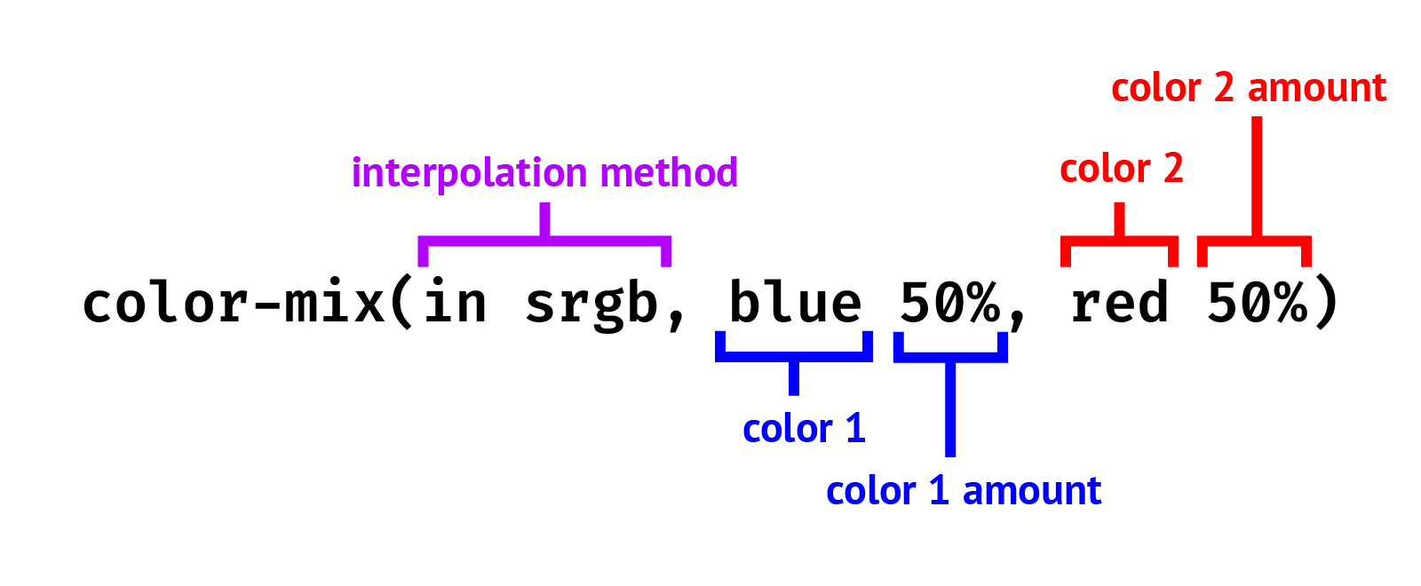
The color-mix() function allows us to specify the two colors we want to mix and then outputs the result. We can control the amount of each color in the mix, as well as the color interpolation space, which determines how the colors blend together.

The color interpolation method is a required parameter. We'll cover it in a later section. For now, we'll use srgb to walk through the examples.
We specify the amount of each color as percentages. If we omit the percentages of both colors, color-mix() will use 50% for each by default. As shown below, mixing red and blue in equal parts gives us a purple hue as expected.
.result {
  background-color: color-mix(in srgb, blue, red);
}
If we specify the percentage for only one color, the percentage for the other color is automatically adjusted so that the total adds up to 100%. For example, whether we specify 90% for blue or 10% for red, the result is the same — a color that's mostly blue with a hint of red.
/* Both these will produce the same resultant color */
color-mix(in srgb, blue 90%, red)
color-mix(in srgb, blue, red 10%)
If the sum of the percentages for the two colors is less than 100%, the color-mix() behavior is slightly different: the sum is saved as an alpha multiplier, and the two colors are scaled using this multiplier so that their total reaches 100%. (See the Percentage Normalization section in the specification for a few examples).
Although both the color-mix() functions below mix the same amount of each color, the second function, where the sum of the percentages is 40%, produces the same color but with an alpha value of 0.4:
/* Result: rgb(128 0 128) */
color-mix(in srgb, blue, red)

/* Result: rgb(128 0 128 / 0.4) */
color-mix(in srgb, blue 20%, red 20%)
Creating light and dark variations with color-mix()
As a typical use case, we often need to create lighter or darker variations of a brand color. To achieve this, we can mix white or black into our base color in varying amounts with color-mix().
The example below demonstrates how different amounts of white and black are mixed with the base color blue to create its lighter and darker variations, showcasing the use of color-mix() in adjusting base color intensity.
/* Initial base color */
.bg-blue {
  background-color: blue;
}

/* 50% blue, 50% white */
.bg-blue-light {
  background-color: color-mix(in srgb, blue, white);
}

/* 25% blue, 75% white */
.bg-blue-lighter {
  background-color: color-mix(in srgb, blue, white 75%);
}

/* 50% blue, 50% black */
.bg-blue-dark {
  background-color: color-mix(in srgb, blue, black);
}

/* 25% blue, 75% black */
.bg-blue-darker {
  background-color: color-mix(in srgb, blue, black 75%);
}
Using custom properties to reuse the color variations
By storing the color-mix() values as custom properties, we can reuse them throughout our code. This approach can be useful when we want to create lighter or darker variants of a brand's primary color.
As an example, the code below illustrates how to create brand color variations using the --brand custom property.
:root {
  --brand: rgb(0 0 255);

  --brand-light: color-mix(in srgb, var(--brand), white);
  --brand-lighter: color-mix(in srgb, var(--brand), white 75%);
  --brand-dark: color-mix(in srgb, var(--brand), black);
  --brand-darker: color-mix(in srgb, var(--brand), black 75%);
}
We can also create variants of different opacities by mixing in transparent:
:root {
  --brand: rgb(0 0 255);
  --brand-alpha-50: color-mix(in srgb, blue, transparent);
  --brand-alpha-75: color-mix(in srgb, blue 75%, transparent);
}
The article Using color-mix() to create opacity variants by Una Kravets explains further.
Example: Styling button variants using color-mix() custom properties
Let's apply the color-mix() custom properties to a practical case: styling a simple button. First, we define the custom properties for our main base and secondary colors. As a bonus, we use color-mix() for our secondary color to mix the base color with pink.
:root {
  --brand: rgb(0 0 255);
  --brand-light: color-mix(in srgb, blue, white);

  --secondary: color-mix(in srgb, var(--brand), pink);
  --secondary-light: color-mix(in srgb, var(--secondary), white);
}
Next, we apply these colors to the primary and secondary button variants, using the lighter color variants for hover states.
button {
  background-color: var(--brand);
  color: white;
}

button:where(:hover, :focus) {
  background-color: var(--brand-light);
}

button.secondary {
  background-color: var(--secondary);
}

button.secondary:where(:hover, :focus) {
  background-color: var(--secondary-light);
}
We're not limited to defining custom properties at the root level only. For instance, we could set a custom property for a component's base color and create variations of this base color within the component's styling using color-mix(). For a secondary component variant, we could simply apply a different base color. This is illustrated below.
.card {
  --color: blue;
  background: color-mix(in srgb, var(--color), white 80%);
  border-top: 5px solid var(--color);
  padding: 1rem;
}

.secondary {
  --color: deeppink;
}
Here's a demo of this concept applied to a variety of UI components.
Creating warm and cool variations with color-mix()
While creating lighter or darker variations of an existing color is a common use case for color-mix(), beyond that, we could also create warm and cool variations by mixing warmer or cooler colors into our original palette.
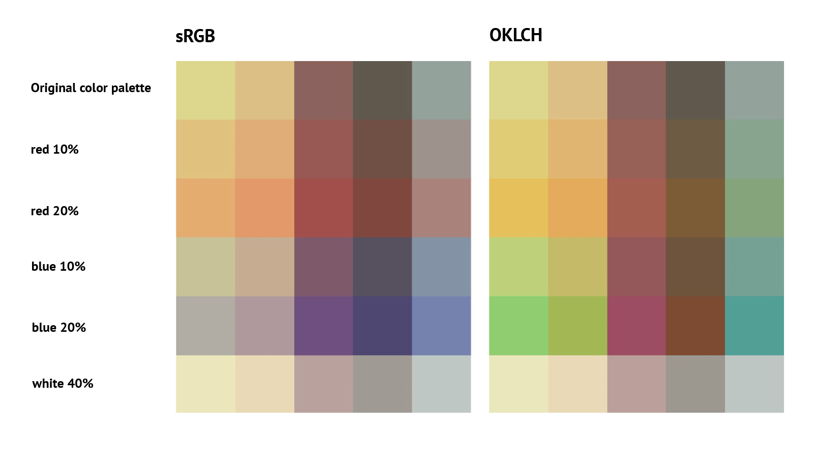
Here we're defining an initial color palette (colors grabbed from Coolors), along with the colors we want to mix to create the warm and cool variants using custom properties.
:root {
  --yellow: rgb(221 215 141);
  --peach: rgb(220 191 133);
  --chocolate: rgb(139 99 92);
  --khaki: rgb(96 89 77);
  --grey: rgb(147 162 155);

  --mix-warm: red;
  --mix-cool: blue;
}

.palette > div {
  --color: var(--yellow);

  &:nth-child(2) {
    --color: var(--peach);
  }

  &:nth-child(3) {
    --color: var(--chocolate);
  }

  &:nth-child(4) {
    --color: var(--khaki);
  }

  &:nth-child(5) {
    --color: var(--grey);
  }
}
Then we're using custom properties to apply the second color mixed into the original base color, as well as specifying the amount. We're also specifying default values, so that if no value is given for --mix, the original base color will be used.
.palette > div {
  background: color-mix(
    in srgb,
    var(--color),
    var(--mix, var(--color)) var(--amount, 10%)
  );
}
This way, we're able to mix different colors and apply them to the entire palette.
.cool {
  --mix: var(--mix-cool);
}

.cool--20 {
  --amount: 20%;
}

.warm {
  --mix: var(--mix-warm);
}

.warm--20 {
  --amount: 20%;
}
Specifying the interpolation color space in color-mix()
In the previous sections, we used srgb (standard red green blue) as the color interpolation method. We can drastically change the outcome by modifying the color space we use for interpolation. Color spaces are a complex topic and well beyond the scope of this article, but it's worth noting some advantages and disadvantages of a few color spaces when deciding which one to use in color-mix().
Exploring the color space options
Color interpolation determines how one color transitions to another. A good way to visualize this is with gradients, as done in the Color interpolation section by Adam Argyle, which goes into great depth about color spaces and gamuts.
Classic RGB interpolation can result in muddy colors in the central interpolation zone (the middle area of a gradient), whereas the colors remain vibrant when using lch or oklch. As illustrated in the image below, the results are distinctly different when applied to the warm and cool color palettes in the previous example.

Unlike srgb and hsl, both oklch and oklab are perceptually uniform. In the words of Lea Verou, this means:
the same numerical change in coordinates produces the same perceptual color difference
Therefore, I tend to prefer oklch and oklab color spaces when it comes to color interpolation with color-mix() — but the choice is yours!
Understanding the shorter and longer interpolation paths
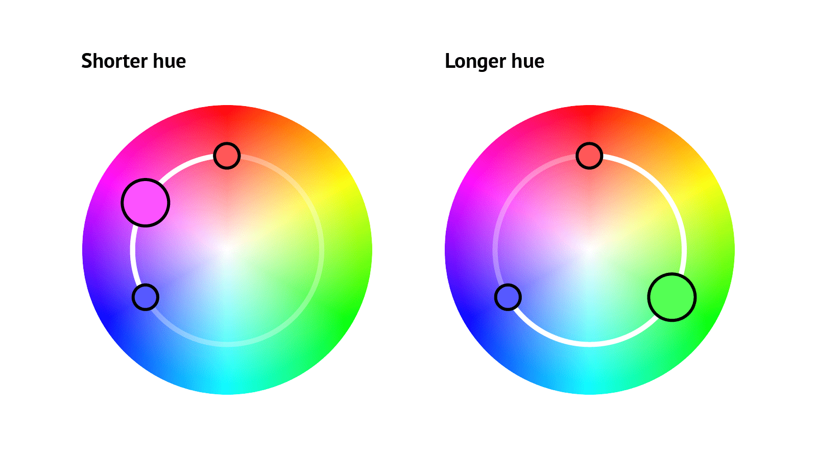
In polar (or circular) color spaces, such as oklch, oklab, and hsl, we can also choose the direction in which the color is interpolated. When we mix two colors equally, the resulting hue angle will be halfway between the angles of the two colors. This will differ depending on whether the interpolation follows the shorter or the longer path around the color circle.
color-mix(in hsl, rgb(255 88 88), rgb(86 86 255));
color-mix(in hsl longer hue, rgb(255 88 88), rgb(86 86 255));

In the frame below, experiment by mixing colors in different color spaces to observe the outcomes.
Browser support for color-mix()
The color-mix() function has been supported in all modern browsers since mid-2023. As always, remember that not all users will have the latest browsers. One way to ensure everyone gets a usable experience is by setting an initial color value. Browsers that do not support color-mix() will ignore the second declaration.
div {
  /* First declaration is fallback for browsers that do not support color-mix() */
  background: rgb(150 0 255);
  background: color-mix(in srgb, blue, red);
}
Alternatively, we can use a feature query to detect whether the browser supports color-mix() and provide styles accordingly:
.card {
  background: lightblue;
}

@supports (color-mix(in srgb, blue, white)) {
  .card {
    --color: blue;
    background: color-mix(in srgb, var(--color), white 80%);
    border-top: 5px solid var(--color);
  }
}
If you use PostCSS, there is a PostCSS plugin that comes bundled with postcss-preset-env. This plugin allows you to write color-mix() functions without worrying about browser support because your code is automatically converted during build time into CSS that's cross-browser compatible. For example:
.some-element {
  background-color: color-mix(in srgb, red, blue);
}
becomes:
.some-element {
  background-color: rgb(128 0 128);
}
It's worth noting, this will only work with static values and not custom properties or dynamic values set in JavaScript.
Color interpolation resources
If you're interested in diving deeper into color spaces and color interpolation on the web, here are a few articles to help you understand them:
- Okay, Color Spaces by Eric Portis
- OKLCH for better color in the browser by Jason Lengstorf
- High Definition CSS Color Guide by Adam Argyle
- Falling For Oklch: A Love Story Of Color Spaces, Gamuts, And CSS by Geoff Graham
- LCH colors in CSS: what, why, and how? by Lea Verou
Summary
We've seen how to use color-mix() to create variations of colors, and how the function can be used in combination with custom properties for use in projects and design systems. With browser support already pretty great, we can look forward to a new era of working with color on the web!